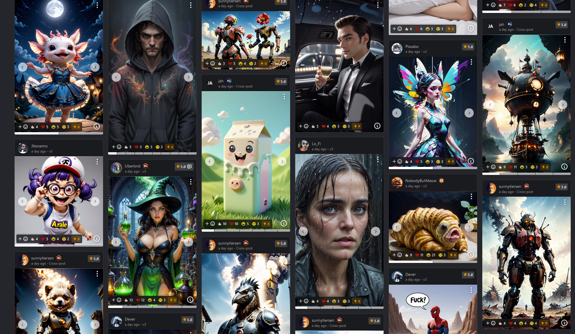
Buzz is too prominently displayed - Distracts from images on thumbnails
The new buzz feature is fine. I'm personally not a fan but I understand the desire for interaction and some currency system on the page.
I do feel like it's a bit annoying when it's displayed at each image / thumbnail.
The bold color of the box for it is really distracting and brings me out of the artwork at display.

I would love it if it was included in the [+☺] button-fold. So it's only visible if you want it to be. I'm fine having it prominently displayed when viewing an image full-screen.
Please authenticate to join the conversation.
Upvoters
Status
Awaiting Dev Review
Board
💡 Feature Request
Date
Over 2 years ago
Author
mnemic
Subscribe to post
Get notified by email when there are changes.
Upvoters
Status
Awaiting Dev Review
Board
💡 Feature Request
Date
Over 2 years ago
Author
mnemic
Subscribe to post
Get notified by email when there are changes.