Download / Create / Run - UI Consistency
Unsure if I should mark as a feature request or bug, but I guess the current design is intentional.
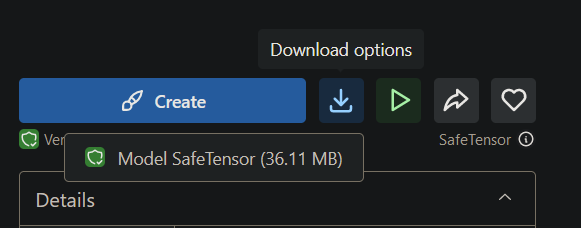
Please keep the buttons for "CREATE" "RUN" and "DOWNLOAD" consistent.
They should always look the same, and be in the same position. Right now I'm "tricked" into pressing CREATE instead of DOWNLOAD which is my inteniton.
Additionally, the DOWNLOAD button becomes a menu when there's an option to use the model with the CREATE feature. Why is this different from when there isn't?
When I'm viewing a model and there's only one model, it should just get that model, not ask for a choice when none is to be made.
It's fine to put all buttons on the same row. Have one clear DOWNLOAD icon, one clear CREATE, and one RUN, whatever this means.
Thanks
Please authenticate to join the conversation.
Awaiting Dev Review
💡 Feature Request
Over 2 years ago
mnemic
Subscribe to post
Get notified by email when there are changes.
Awaiting Dev Review
💡 Feature Request
Over 2 years ago
mnemic
Subscribe to post
Get notified by email when there are changes.