Review Interface Alignment
As I user, I'd like to update review system to be more intuitive and in line with user expectations.
Expectations - are we doing reviews, or are we doing likes - reviews add value, likes add dopamine but not much else. There's a mix of both intentions in the UI at the moment which is going to cause confusion and potentially contention especially with the competitive leaderboard crowd.
More obvious weighting/consideration/visiblity would help in cases where:
User has not downloaded resource, user has liked
User has not downloaded resource, user has disliked
User has downloaded resource, user has not provided representative output, user has liked
User has downloaded resource, user has not provided representative output, user has disliked
User has downloaded resource, user has provided representative output, user has liked
User has downloaded resource, user has provided representative output, user has disliked
This breakdown could be added to the "postive/overwhelmingly positive" page as a graphical widget, or a simple breakdown. If this type of output is provided, then contextless/no-download reviews shouldn't be attributed to individual users as this will lead to further instances of "mod pls remove thumbs down omg wtf !!!!!!!!1!!!one"
Removing the names of contextless upvotes will also help to reduce "amateur sleuthing" and accusations of shill account upvotes, while weighting will reduce the impact of these types of behaviour for users who particularly care.
As the "value" to creator and community in each of these cases is different and would provide a different balance of information, if we're using this system to represent a community quality value of a given resource.
Interface tweaks -
1) Move counter of reviews into stats with 👍(thumbs up, positive) symbol - do not promote the number of 👎(thumbs down, negative) reviews
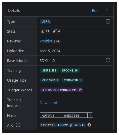
2) remove redundant current review count from Reviews line.
3) align the functions of the two following functional elements, or create a clear separation of functionality/UI design, as the outcomes appear to differ.
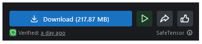
Here, 👍 creates a "review" & adds to users favourite list - people may be unaware that this is leaving a review, and there's no obvious way to bookmark/favourite a resource in this design, so this will create confusion/contention over the way "reviews" are counted.
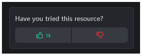
Here, 👍leads to the review interface.
4) Promote the following UI element to the model card, rather than underneath the model stats link and or add review menu: this is implemented already, if you download the model.
5) update the UI to remove the star and add 👍 to the following UI element;

6) Have you tried this resource - Civitai knows if a logged-in user has downloaded a resource, so this messaging could be amended in this case to be more affirmative for those users. this is implemented already, if you download the model.
Please authenticate to join the conversation.
Awaiting Dev Review
💡 Feature Request
Almost 2 years ago
MajMorse
Subscribe to post
Get notified by email when there are changes.
Awaiting Dev Review
💡 Feature Request
Almost 2 years ago
MajMorse
Subscribe to post
Get notified by email when there are changes.